Laurel Road: Digtial Banking
RESEARCH
USER FLOWS & JOURNEY MAPS
One of the most valuable skillsets I bring to any team is my ability to drive deep analysis of very complex banking, lending, and student loan repayment solutions. A way that I achieve this is by creating in-depth user flows and experience maps. Using Miro, I deliver extremely detailed and comprehensive mapping of crucial internal processes, user flows, product experiences, and persona-base journeys. This is a critical way to understanding our users and addressing pitfalls in our products. These flows were then distributed not only to product team members, but across the company all the way up to leadership. Everyone, including engineers, referenced these maps to assist in making product decisions and were crucial to help team members understand complex systems.

USER INTERVIEWS
Talking to consumers about their banking preferences, feelings toward their bank(s), and getting their genuine thoughts about our products have become a priceless tool that leads to our product improving and continuing to innovate. Recently, I conducted 10 user interviews using UserTesting.com to understand why consumers chose to open a High Yield Savings account with the bank that they did and uncover what benefits of this type of account were most important to them. I felt that gathering this qualitative data and getting a holistic view of the voice of our customer would assist in the business goal to increase deposits by millions of dollars over the course of 4 weeks.
While pulling interview insights together in UserTesting.com, I realized that we have a pretty big challenge to face with consumers - the high rate we were offering caught their attention, but given the recent bank closures, users were hesitant to bank with a brand they’ve never heard of before. Additional key insights below:
Participants cared most about the APY we were offering and that we are FDIC insured.
While our high interest rate of 5% was of interest to most of our participants, there was still a feeling of uncertainty with switching to an unknown bank. We still have a lot of work to do in building trust with potential members.
Before opening a new HYSA, participants did their research. Whether it be Google, YouTube, NerdWallet, or reviews from current customers, participants needed some background on the account and it’s offerings to compare to other banks before making any decisions.


RESEARCH & CONTENT PROPOSAL
During my time at Laurel Road, we acquired a company called GradFin - a platform that provides personalized student loan advice to help people uncover what student loan forgiveness program is right for their needs and helps guide them through the complex process that is student loan forgiveness.
In order to bring GradFin into the same level of design and user experience that is a part of the Laurel Road brand, I was tasked with delivering a content proposal for the GradFin website that would outline changes in their information architecture and page content needed for a best in class user experience.
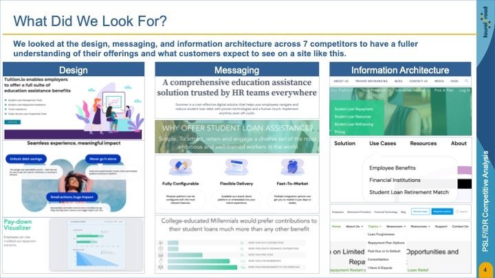
To kick-off this project, I conducted some competitive analysis looking at seven B2B and B2C competitors focusing on three main categories - design, messaging, and information architecture.
Once I had a deep understanding of the current competitive landscape, I mapped what the current website architecture was for GradFin. I wanted to have a clear vision of what GradFin’s current experience is so that I could analysis the website. Keeping competitor sites in mind and comparing it to the current architecture, I was able to propose a more streamlined navigation, which included moving several items to the footer, rearranging the page order, and in some cases cutting content out completely.
Before


PRODUCT REBRAND + EXPERIENCE UPDATE
Since Laurel Road acquired GradFin, we needed our own version of their PSLF (Public Service Loan Forgiveness) / IDR (Income Driven Repayment) certification portal. In it’s current state, the process of a user certifying for either of these programs is confusing because of the many required steps, unclear instructions about wait times and when to go to government websites to collect documentation, and unclear navigation.
Before

Before

After

In order to help GradFin, leadership, and other stakeholders understand this proposal, I created simple, lo-fidelity in Figma to visually show how their content would work in this new structure. The site is now targeting and messaging to FAs to keep navigation clear and eliminate redundancy. Instead of individual “Terms of Use” pages, important documents have been moved to the footer.

Design & Collaboration

After

On the left, you’ll see the current state of the GradFin concierge experience. On the right is our updated proposal. The process of student loan forgiveness is confusing and requires the user to navigate through different government websites in order to provide us with important documentation. In order to improve the user experience, we proposed simplifying the steps on the home screen and adding tab navigation within each step. This design also meets the business’ need to stand up a Laurel Road version of this experience quickly. This project required us to design the entire flow in two weeks so engineering would have enough time to build it out before launch. That meant we had to blend our desire to dream big and improve the user experience as much as possible, while keeping most of the functionality and structure similar to current state design.
Moving through the various steps a user needs to complete in order to complete certification, we added more detailed instructions within each page to clarify for the user what exactly they need to do - this breakdown makes each step much more digestible. We also removed unnecessary buttons. You’ll notice in the current state on the left that there are three CTA buttons in the bottom of the screen. Because the user can take more than one action here, it’s critical to establish hierarchy and streamline the use of buttons on each page. Across the entire flow, we were also tasked with updating the UI so that it follows the guidelines in our Laurel Road design system, which helps establish brand consistency and overall clarity.

BRAINSTORM SESSIONS
I’ve shared how important collaboration has been throughout my time at Laurel Road, but it has been particularly important in the design phase of a project. It can be hard to decide on the best layout and what elements need to be included in a new design especially if the ask is for something we’ve never built before.
Enter brainstorming sessions! In these sessions, I sit down with our UI/UX designers and UX content writer to “take pen to paper” before diving into Figma. I bring my expertise of the banking and lending landscape, to help make design suggestions and inform the team of industry standards or best practices. Once we have an understanding of the scope of the project and tech limitations, we start gathering and outlining ideas on a whiteboard. While Laurel Road provided the product team with a suite of design and research tools for us to use, nothing beats getting on a physical whiteboard and roughly sketching out design ideas. I always make sure these sessions are a judgement free zone - there are no bad ideas.
The goal of these sessions was to come to an agreement on the design direction for the project so we could jump into Figma.

After


WHAT I’VE LEARNED
While at Laurel Road, I’ve had the freedom and opportunity to dive into challenging projects and am reminded that my curiosity is a strong team asset. Asking questions to gain clarity on a project or bring in team members to critically review progress is not only a good practice in accepting feedback, but bringing in different ideas or challenges makes the project a stronger user experience.
I’ve also confirmed that I have passion for leadership and working with my team, keeping them on track, and leading team exercises has only confirmed that I want to get into more leadership roles. I’m hoping to participate in leadership training courses while I continue to hone my UX research skills so that I can bring even more to the table.

EMAIL COMMUNICATION AUDIT MAP
As a UX researcher, I’m constantly looking for ways to improve our user’s experience. This includes the various communication channels we leverage to keep our customers up to date on their accounts and/or inform them of important industry updates.
Enter the email communication audit. Using Miro, I collaborated with product and marketing team members to not only map out the current email communication streams for every Laurel Road product, but to also understand and indicate the platform the email was sent on + what triggered an email to be sent. The goal here was to be able to identify any gaps, duplicates, overlap, and/or oversights in our communication. Once I conducted this analysis, I was able to present my findings to each product team, giving them specific insights and next steps to walk away with.
Top General Insights:
Treat product bundling as a unique user experience. This reinforces the value and benefits of the bundle and drives stronger engagement.
Leverage ‘save and return’ capabilities in order to provide the user with key status and milestone updates.
Expand communication offerings so it’s easier for the user to stay up to date and engage with our products using their preferred channel.
Laurel Road is a digital banking platform and brand of KeyBank that provides tailored solutions to support the financial wellbeing of healthcare and business professionals. Laurel Road is able to lead the way to innovation in the banking industry by having the capability of a fintech company with the credibility of a regional bank.
MY ROLE
Throughout my day-to-day, I collaborate with UX writers and designers and utilize a vast tool belt of user experience skills and methodologies that I’ve refined throughout my career. I’ve been able to carve out a unique space for myself at Laurel Road and take on this opportunity to deliver impressive projects that have been referenced and used throughout the company by engineers, designers, and leadership to achieve a balance of business goals and user needs. I’ve demonstrated my best assets throughout my time at Laurel Road, including problem solving, supportive team leadership, and a propensity for leadership that has significantly contributed to the success of the product design team.
Being on the product design team means that I have a hand in improving the experience for Laurel Road customers across all our product offerings. Some of my best work has been for our leading student loan forgiveness product, the online banking platform, and assisting in creating a strong team connection through team retrospectives. Throughout this case study, I outline examples of the wide range of research methodologies I’ve used across various projects including information architecture, usability tests, user interviews, insight analysis, user flow mapping, and wireframing.
TITLE
User Experience Researcher & Designer, Product Design Team Lead
TOOLS
Figma, FullStory, Miro, UserTesting.com, UserZoom, Zoom, Slack, Microsoft Office Suite
TIMELINE
June 2022 - Present